Support the Timberjay by making a donation.

Finalists selected for new Minnesota state flag
REGIONAL- The Minnesota State Emblems Redesign Commission (SERC) unveiled their top design picks for a new state flag and state seal last week, and a large swath of Minnesotans appear to be less than …
This item is available in full to subscribers.
Attention subscribers
To continue reading, you will need to either log in to your subscriber account, or purchase a new subscription.
If you are a current print subscriber, you can set up a free website account and connect your subscription to it by clicking here.
If you are a digital subscriber with an active, online-only subscription then you already have an account here. Just reset your password if you've not yet logged in to your account on this new site.
Otherwise, click here to view your options for subscribing.
Please log in to continue |
Finalists selected for new Minnesota state flag


REGIONAL- The Minnesota State Emblems Redesign Commission (SERC) unveiled their top design picks for a new state flag and state seal last week, and a large swath of Minnesotans appear to be less than inspired by their choices.
The 13-member commission was created by the legislature last spring to redesign a flag that has faced criticism for its outdated design and lack of representation. Featuring the state seal, a complicated design that many have derided as racist for its depiction of a Native American on horseback being displaced by a white farmer, the current flag breaks virtually every principle of good flag design as outlined by the North American Vexillological Association, the world’s largest group devoted to the study of flags. The current flag is also difficult to distinguish from the flags of other states which also display state seals on a field of blue.
Commissioners drafted a set of design objectives to guide submission creators and provide a framework for making their selections. Those objectives included:
• Simplicity and Recognizability: The flag should be so simple that a child can draw it from memory and can be easily recognizable from a distance.
• Distinctive Colors: Utilize a color palette that represents the state effectively. Blue, green, and white are often associated with Minnesota’s natural beauty, while red and yellow can symbolize its vitality. Limit the number of colors on the flag to three to four.
• Enduring Appeal: While honoring the state’s history, the flag design should also represent Minnesota’s enduring values and aspirations, emphasizing inclusivity and unity.
• Symbolism: The flag’s images, icons, colors, and/or patterns should relate to what it symbolizes.
• Symmetry: The design should be symmetrical to a degree.
• Mandatory: Symbols, emblems, or likenesses that represent only a single community or person, regardless of whether real or stylized, may not be included in a design.
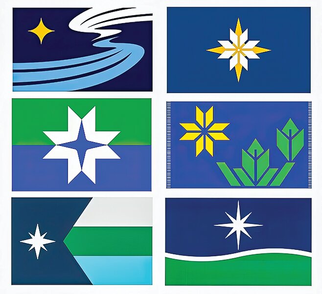
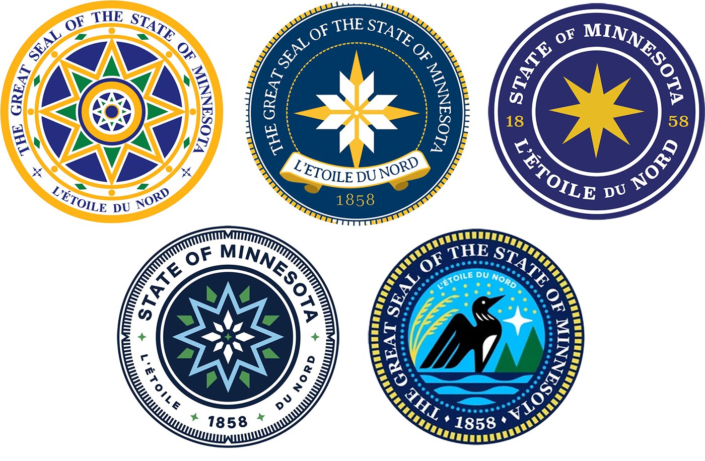
Commissioners met for hours on Tuesday, Nov. 21 to narrow down over 2,300 possible flag design submissions from the public to five but ended up choosing six. They also chose five finalists for the state seal.
Design elements
Each of the six finalists feature a representation of the North Star, a nod to the state’s motto “L’Etoile du Nord,” the star of the north. The North Star is the single prominent element in one of the designs, while a large yellow version overlaid with a white snowflake dominates another. Smaller versions in both yellow and white are depicted on the other four. The North Star was the most frequently used symbol among all submissions.
All incorporate the colors blue and white into their designs. Two flags use two different shades of blue to represent the sky and water. Four of the flags use green to depict the state’s lush landscapes, forestry and agriculture. Yellow is used for the North Star in three of the designs, and one uses yellow stripes on a border to represent the state’s Native Tribes, while using similar white stripes to represent the state’s counties. Three of the flags incorporate a horizontal stripe motif, while one has a stylized polygon reflective of the state’s unique shape.
While the commission has not identified the designers, several have spoken publicly about their work.
Sarah Agaton Howes, a Fond du Lac Ojibwe artist and small business owner, submitted design F1435 based on Ojibwe loom style that features a large yellow North Star and stylized green trees, with small border stripes representing tribal nations and counties.
“The flag that we currently have is really harmful and really based on Native nations disappearing,” she said. “And so I’m really excited to just represent who we are as Minnesotans, and also, as a Native person.”
Todd Pitman, a St. Paul graphic designer, created F944, which he calls “Mirror of the Sky.” The flag was a family effort: he designed it with input from his parents.
“I just truly love my home state, and I really feel like it deserves a flag as unique and dynamic as the people who make it such a wonderful place to live,” he said.
Pitman’s design features two large swirls, the lower one in blue representing the state’s pristine bending waters and the upper in white reflecting snow, clouds, and aurora, with a four-pointed yellow North Star inspired by the symbols and astronomy of the Dakota and Ojibwe tribes.
Twin Cities-based product designer and writer Brandon Hundt said he’s been working on his design, submission F29, since 2015. His design features a large yellow four-pointed North Star overlaid with a white snowflake, laid out on a field of blue.
“The land of 10,000 lakes. The Great Lakes being in Duluth. The mighty Mississippi is formed in our state. If any state has a case to have a blue flag, it’s Minnesota,” Hundt wrote in his designer statement.
Hundt leaned into the guideline that the flag should be simple.
“Flags should be simple because they’re up on a flagpole, often very high,” Hundt told MPR News. “And I think that’s the thing that often gets overlooked. We need to think about how these flags are going to look on a flagpole.”
Public reactions
The flag redesign could be generating the most public feedback of any state initiative since the imposition of mandated COVID-19 pandemic restrictions. With 24 hours of posting the finalists for comment on their website, the SERC received thousands of comments. Social media has been flooded with comments, and unsurprisingly they’ve been mostly negative.
One camp is firmly of the belief that the current state flag is fine as is and shouldn’t be changed at all.
“What’s wrong with our current flag?” was a common refrain on numerous Facebook posts.
“The current flag is fine and rather classy looking,” someone said.
MPR News contributed to this article.
Another category of comments focused on the designs themselves. A sampling of comments includes the following:
“None of these designs scream pride in Minnesota. It is like they went with the most generic designs to make sure no one could possibly be offended by it.”
“I agree with those who say they look cartoonish or drawn by kindergarteners.”
“They all look like corporate logos.”
“To say I’m disappointed is an understatement. I’d rather say thanks, but we haven’t found anything that really checks the boxes, so we’ll hold off and do another round of submissions in a few months.”
“They all look like the symbols from the NYTimes game ‘Tiles.’”
A subset of design critics lamented the exclusion of the state bird, the loon, from any of the flag finalists, although one state seal design included a loon.
The commission acknowledged that after the North Star, the loon was the most popular image among flag submissions, but those entries were ruled out because the loon is not found statewide.
Moving forward
The SERC website, https://www3.mnhs.org/serc, will remain open to receive comments until Dec. 1. The commission will have until the end of the year to choose a final design. The commission can make changes to colors or design elements as they deem appropriate.
Once the commission makes its choice, the state legislature will have the chance to weigh in. Legislators have the option of rejecting the commission’s recommendation. If they accept it, then the new flag and seal will be introduced on May 11, Minnesota Statehood Day.
The winning designer will receive public recognition, but there is no monetary award attached to winning. The commission, whose work is being facilitated by the Minnesota Historical Society, was allocated $35,000 from the legislature to conduct its work.


